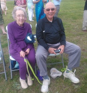
I recently traveled with my aging parents to my sister’s wedding on Chesapeake Bay. It was a lovely weekend and everyone had a great time, yet while I see my parents every week, living and traveling with them for four days reinforced to me just how much care we, as designers, need to take in designing for accessibility.
My parents are both in their mid-80’s and I think they get around pretty well. They are both in good health, yet do suffer from typical effects of aging such as diminished hearing, vision, balance, and mobility. Consequently, traveling to unfamiliar places poses a challenge. They don’t hear instructions by TSA agents, hotel clerks, and restaurant servers well when there is a lot of background noise. They get tripped up when floors and transitions are not smooth or stairs are of an uneven height. They don’t immediately identify signs and wayfinding clues. Watching my parents navigating unfamiliar terrain made me realize just how much work we have cut out for us in creating designs for our clients that work to diminish these challenges.
The elderly are not the only ones that need good accessibility design. Anyone who has ever broken a leg or ankle or for whatever reason was restricted to crutches or a wheelchair can tell you just how challenging getting around can be. Entrance ramps that are supposed to provide accessibility are often at the wrong angle and require tremendous effort to mount. Restrooms that do not follow ADA accessibility guidelines are next to impossible to navigate alone. Most operatories are designed for the efficiency of the staff and do not take the ability of the patient at all. Good signage in dental offices is almost non-existent. Patients of all ages can benefit from better accessibility design. Our job as dental office designers it to make sure our clients’ practices excel in providing it.

