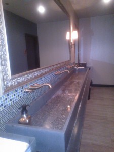
We’re always on the lookout for new and interesting design ideas that hopefully, one day we’ll be able to incorporate into a project for one of our clients. While we’re not exactly sure how we’d work this into a dental office design, the Coup d’état restaurant that recently opened in Minneapolis’ Uptown District really has a fun twist on restroom design. Rather than completely separate facilities for men and women or the increasingly popular unisex arrangement, they still separated the main facilities between the sexes but combined the hand-washing station into a single, long, poured concrete trough with several faucets positioned along the length. This common area not only affords a great pattern interrupt from the same ol’, same ol’ in restaurant restrooms, it makes great use of the long, narrow hallway that so often accompanies access to restrooms. Plus, because it is unexpected patrons to the restaurant engage in spontaneous conversation while washing their hands before returning to their tables. What a great way to get people off their phones and talking to one another!
 Of course, we cannot forget those with disabilities. One end of the trough was lowered and had its own sink at a height and design compliant with the Americans with Disabilities Act. This feature was also poured concrete and integrated into the whole so it felt natural and a part of the design rather than an afterthought or special accommodation.
We applaud the designers for Coup d’état on their creativity and originality and look forward to the chance to flatter them by “copying it” in one of our own. (Oh, by the way, the food is really good, too.)

