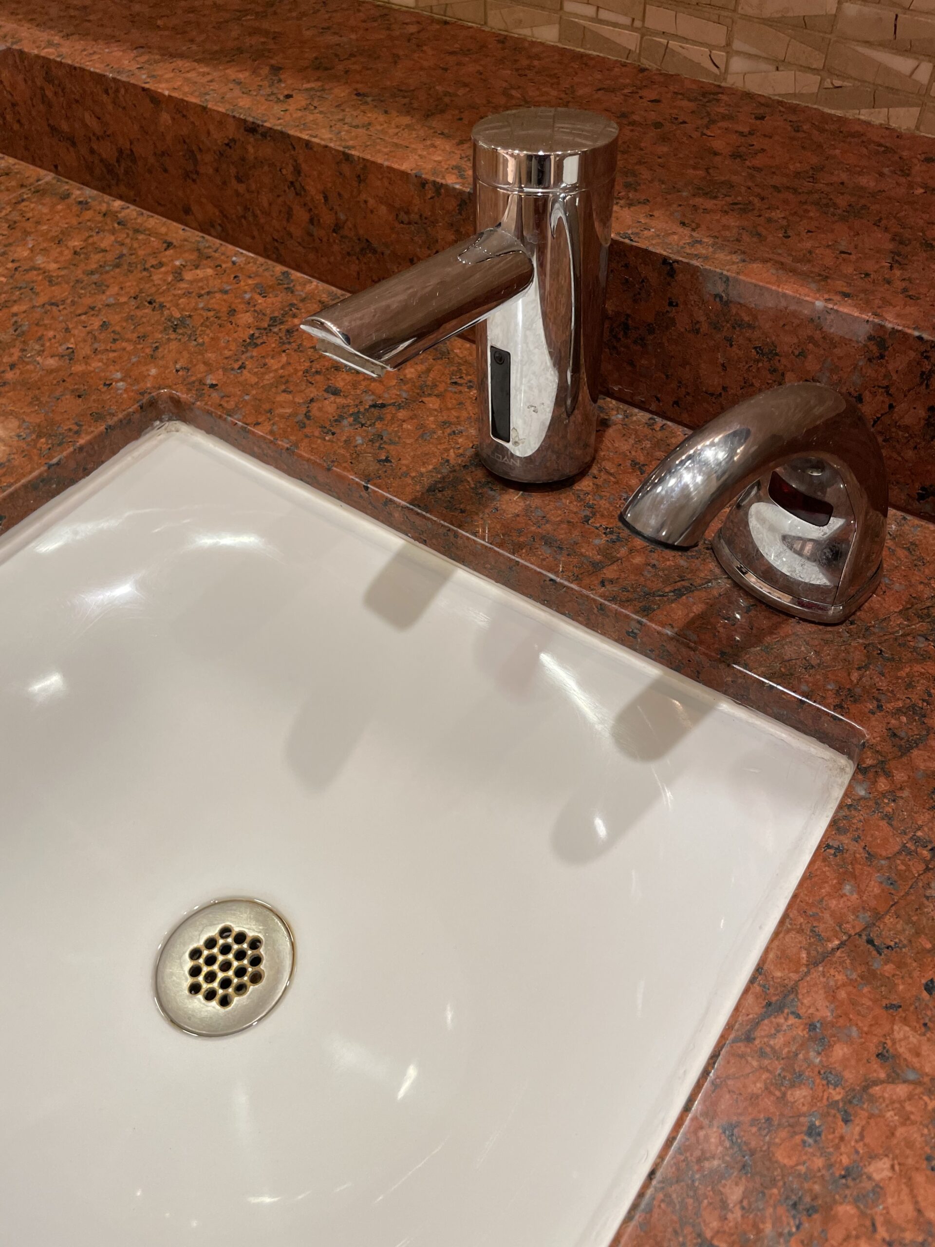
Are there such things as design fails? Of course.
When designing a bathroom or kitchen, I generally tell my clients that there are no rules, and one should focus on what they like and how they live as the guides to design. However, every once in a while, I come across a few design features, especially in public spaces that are obvious design fails. For example, one area that seems to really trip people up when designing a bathroom vanity is getting the right sink and faucet combination so that the vanity is actually functional. Yes, one needs to be mindful that people are going to need to wash their hands in the sink, and to do that effectively one needs to be able to get one’s hands under the stream of water.

A recent example of poor design is the lovely, inverted arc of the sink bowl produces a very shallow rim around the edges of the sink. The faucet that was chosen doesn’t arch far enough out over the bowl to dispense the water into the sink and allow room to put one’s hands under the flow and not bump into the sink bottom. After the last year, we’ve had where washing one’s hands have never been stressed more, having a sink and faucet combination that allows for effective washing seems poignant.
Another area where folks seem to really miss in their design is the placement of towel bars relative to the sink, tub, and shower. Where sinks are located at one end or in the very middle of a long counter expanse, the towel bar needs to still be within easy reach of the sink.
I know of no one that likes to drip water across a long expanse of an open counter in order to reach the towel after washing their hands or face. Also, I cannot say how often I have seen towel hooks located so that when one opens a shower door the towel is now located behind the open door, requiring one to step entirely out of the shower and close the door to get to the towel. The alternative would be to take the towel off the hook and place it on the toilet seat. Why would anyone want to do that?

