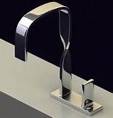
 In order to achieve a great patient experience form and function must meld together seamlessly through the design so that there are no negative pattern interrupts. This is not always easy to achieve and requires the designer and user to work closely together to understand how a space is going to be used on a daily basis. If this doesn’t happen things that look good on paper may not work well at all in application. For example, I recently saw a lovely faucet that had beautiful curved, modern lines; however, to turn the water from cold to hot one had to rotate the control counter clockwise to rear of the faucet. Anyone that is left handed could not reach the control while standing directly in front of the sink and had to step to their right in order to operate it. Function Fail.
A more common function fail we see in dental office designs is the lack of anywhere to hang one’s coat. We understand most patients do not like the idea of leaving a coat unattended in the waiting room, but rarely do we find any accommodations made in the operatory to put them. Coats end up draped over a side chair or scrunched in the corner of the room. How hard is it to put a couple of coat hooks in each room?
Positive pattern interrupts are great in design. They wake people up from the fog they tend to wander through and causes them to pay more attention to their surroundings and makes an experience more memorable. However, unlike negative ones, the memories are good ones. For example, a woman walking into the restroom at her dental office to find a special shelf for her to place her purse on so it isn’t merely sitting on the floor or counter comes as a pleasant surprise.
The goal in designing the patient experience is to blend form and function together so the memories are all positive. When this is achieved patients go away telling their family and friends only good things which generates more referrals and subsequently more patients and the practice grows. Another good thing.

